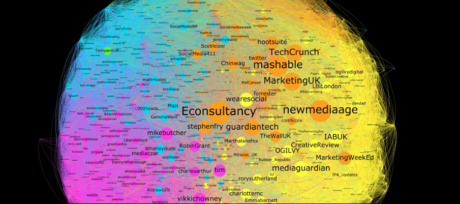
Yesterday I spotted that those clever people over at Tempero had created a visualisation of the social network that connects the top 1,000 most influential companies and individuals within London’s social media community.
Based on data sourced by the agency’s own discovery tool, Mappr, analysts Simtan Bacha and Lisa Brooker crafted the lovely looking thing below.
While interactive visualisations like this might look nice (and massage the egos of London’s social community), these kinds of mapping activities can add real value to those wanting to spot clusters of influence and connectivity.
Not to mention the fact that people without a data mindset respond far better to visuals. I actually wrote a piece for Econsultancy last year based on research from Google’s Enterprise division and Vanson Bourne about the same issue. Back then, 90% of 250 marketing managers in the transport, finance, public sector and retail industries said that they are using, or have plans to use, mapping and geospatial technology as part of their marketing strategy.
Thanks to Jez Hughes for flagging.
